-
Nutra Offer Promotion Strategies in 2025: Push the Pain — Boost the CR | Part 220.6.2025Reading Time: 7 minutes
When your product is about health, pain, body insecurities, weight, or intimacy, you can always leverage three powerful triggers: fear, trust in medical authority, and visual contrast.
These form the foundation of three evergreen approaches that still work wonders in Nutra, especially with the 35+ audience:
- Medical Authority: White coat trust, endorsements, expert opinion
- Symptom-Based Creatives: Fear — “You already have this and aren’t treating it”
- Before & After Effect: “Amazing results with minimal effort”
In 2025, these methods are borderline bannable. But if you understand how to fly under the radar of Facebook and Google, they’re still some of the most effective strategies out there.
The article breaks down hacks and insights for each one: what to run, where, who to target, and which tricks perform best.
Medical Authority Approach
This approach relies on visuals of doctors, medical staff, clinics, and a healthcare-themed design. The creative usually includes a person in a white coat or common medical symbols. The message is clear: the product is recommended by professionals, and therefore safe and effective.
💡 Creatives sourced from TyverSpy.
Want to test the service for free? Message @Misha_Tyver on Telegram with the phrase ADCOMBO TRIAL. And when you make your first payment, get 20% off with the promo code ADCOMBO.To work well, the medical angle should be tied to a narrative. Ads can appear as a doctor’s advice (“Doctor recommends a new joint pain remedy”) or a scientific update (“Researchers have discovered…”).
Common tactics include:
- Doctor photos (or actors) — ideally matched to the GEO (e.g., a European-looking doctor for Tier-1, an Asian doctor for Asia). Avoid real names; use generic or fictional experts.
- Copy emphasizing expertise: phrases like “Recommended by top cardiologists.”
- Prelanders with documents, stamps, charts to build trust.
Product Categories That Perform Well
The medical angle works great for most nutra products, especially where expert opinion matters:
- Chronic conditions & pain: joint creams, hypertension, diabetes, prostate supplements — people 40+ often trust doctors more.
- Men’s health/intimacy: medical framing helps if styled like “Urologist recommends a natural solution.”
- Weight loss & detox: position it as a nutritionist’s method or a metabolism study from endocrinologists.
- Cosmetics/dermatology: “Dermatologist recommends this anti-aging cream” for issues like psoriasis, wrinkles, etc.
GEO Considerations
The medical approach has the broadest geographic applicability — but comes with many nuances.
In Tier-1 countries, regulators closely monitor phrases like “doctor-approved”. That said, trust levels are also higher in these regions. Avoid bold, absolute claims such as “clinically proven” or “cures in X days.” Instead, go softer: “specialists report improved outcomes” or “recommended by professionals.”
In Asia, medical authority is respected, but local traditional medicine can be blended into the narrative for added resonance. Latin America and MENA markets often respond positively to expert framing, while in CIS countries, audiences may be more skeptical — and sometimes even mock “TV doctors” or overly polished medical figures in ads.
Platform Guidelines
Advertising platforms impose strict regulations on medical content. Before launching any campaign, make sure to review the specific policies of each platform. However, common restrictions typically include:
- No guaranteed outcomes (e.g., “permanently cures arthritis”)
- “Clinically tested” claims require official documentation
- Avoid images of needles, blood, and words like “treatment,” “diagnosis,” “injections,” or “surgery” in ad copy
Always be ready to provide compliance certificates. All in-house offers at AdCombo come with the necessary documentation — just request them from your affiliate manager.
2025 Tips
The “expert-backed” approach — featuring doctors or recognizable figures — remains effective, especially as consumer trust in traditional advertising continues to erode. Far from outdated, the medical angle is gaining momentum.
- Realism matters. Users are becoming more discerning. The same stock image of a “doctor” circulates through hundreds of ads. Whenever possible, use unique visuals — either lesser-known faces or custom shots taken with a smartphone.
- Be vague on purpose. Use neutral, non-specific language — it’s better to say “scientists discovered…” without naming anyone than to fabricate credentials.
- Use black-page prelanders. The medical narrative is safer when built into a pre-sell page, while keeping the actual ad creative more subtle. Formats like fake interviews or news-style stories (e.g., a doctor explaining the condition and the product) work well. They’re less aggressive than direct, hard-sell landers and often get better approval rates.
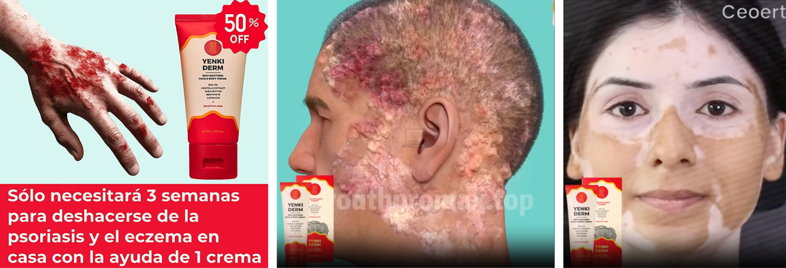
Symptom Demonstration Approach
This taps directly into fear by showing the user what the problem looks like — and what happens if it’s ignored. Shocking, disturbing, or graphic imagery triggers an instinctive threat response. The idea: the user recognizes their own condition and reacts emotionally—then immediately sees a solution.
💡 Creatives sourced from TyverSpy.
Check out service updates in the channel @tyver_enThe prelander supports this visually with anxiety-inducing text like: “Here’s what happens if you don’t treat it…” Then transitions into: “Luckily, there’s a solution.”
Best-Suited Offers
- Parasites, fungus, dermatology: The grossest visuals (worms, infected skin) drive high CTR.
- Joint/back pain: X-rays showing joint degeneration or an old man with a cane — fear of disability works.
- Diabetes, stroke: Consequence-based images — amputations, hospital scenes, or even just a scared face + a glucose meter showing high sugar.
- Potency: Physical symptoms are hard (and prohibited) to show, but you can frame social symptoms — a wife turning away in bed, or a woman leaving her man.
- Weight loss: The reverse angle — obesity, a fat belly, or a woman crying because of her weight.
Ideal Audience
This approach performs best in GEOs where medical literacy is low or healthcare is expensive. People need to genuinely fear these conditions, and their culture must tolerate such visual cues.
In developed markets, overly shocking creatives can backfire or trigger complaints. Users there also understand that serious illnesses require real medical treatment — not a product from an ad.
Age matters too: symptom-based visuals generally target an older audience.
Where to Run These Ads
Most major ad platforms have strict rules against shock content — gross imagery is banned, and you can’t portray someone as sick or highlight physical flaws.
But teaser networks, push traffic, and native networks are more flexible. While they still demand “user respect,” moderate shock (e.g., close-up of an arthritic joint) still gets approved — especially on less regulated platforms.
Creative Tips
- Simplified Visuals. By 2025, ad platform algorithms have gotten smarter — old tricks like blurring images or inverting colors no longer help. Still, some affiliates get around it by using illustrations (e.g., a drawing of a fungus instead of an actual photo).
- Plausibility. Don’t overdo it. A picture that’s too grotesque yet clearly fake kills trust. A real image of the condition (even if unpleasant), works better — the viewer thinks: “Mine looks almost the same…”
- Combining Problem & Solution. It can be effective to show both the issue and a hint at the fix. For example, a split-screen visual — on the left, clogged arteries; on the right, clean arteries after treatment — “Here’s the problem. Here’s what we offer.”
Just make sure it’s allowed — this borders on “before/after.” - Fear-Driven Prelander. Let the first half of the pre-sell page build fear — “1 in 5 will die from this…”, “parasites can cause cancer.” Be careful with fake claims, but a bit of exaggeration is part of the affiliate toolkit. Then smoothly transition: “Fortunately, there’s now a solution…” and introduce the offer. Just don’t overextend the scare part — users might bounce before the pitch.
In today’s environment, many affiliates are stepping away from pure shock tactics, calling them “a thing of the past.” A subtler blend of strategies tends to perform better.
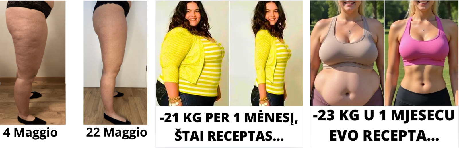
Before & After Creatives
Everyone knows the classic before-and-after photos showing dramatic results after using a product. The goal is simple: visual transformation triggers a “wow” effect and builds belief — if it worked for them, it must work. This is one of the oldest and most popular approaches in the nutra space.
💡 Creatives sourced from TyverSpy.
Check out service updates in the channel @tyver_enBest-Suited Offers
In nutra, this is most commonly used for:
- Weight loss: Person before/after diet or detox
- Anti-aging: Wrinkles gone
- Hair growth, skin, teeth: Any visible change
How & Where to Use
The visual message is universal and clear without words, making it suitable for almost any GEO. In countries where appearance and body culture are strong, these images hit hard — everyone wants that magical transformation.
But here’s the catch: ad platforms heavily restrict this format. Showing physical changes in a before/after context is often flagged as body shaming or unrealistic claims. Most platforms ban visuals that focus on imperfections or promise extreme results.
Creative Execution
- Use real photos. Ideally, it should be the same person in both images. Not always easy to find, but you can source transformation pics from forums or social media.
Make sure to use different backgrounds/clothing — same-day shots with identical settings scream “fake.” - Compare more than just appearance. Get creative:
→ A wardrobe shot: “Before: size 52” / “After: size 44”
→ A food plate: “Before: 2,000 kcal” / “After: 1,200 kcal”
These indirect comparisons feel fresher and sometimes pass moderation more easily. - Short-form video content. In 2025, short reels are trending. Try a video slideshow with a smooth transition from before to after. Some get approved as UGC-style reviews, but be ready for fast bans — keep backup accounts.
- Landing page strategy. Run ads without before/after imagery, but show the photos on a black-page lander or prelander instead.
- Review format. Frame the visual as a testimonial — e.g., “Maria shares her transformation photos.”
The before/after format still works — because it visually proves results, and that’s incredibly persuasive psychologically. But it’s outdated for moderation. In 2025, many affiliates now lean into softer versions: Show only the “after”, and imply the “before” through copy or contextual contrast.
Final Thoughts
The core idea here is clear: you’re leveraging fear, pain, and emotions — the most powerful (but riskiest) drivers in affiliate marketing. Do not overpromise, fabricate, or present unrealistic results — both the user and ad platform moderators will catch on quickly. Instead of brute force, build smart funnels and deeply understand your target audience’s pain points and needs.If you missed it, read Part 1 of this series — and stay tuned for the final part, where we’ll dive into teaser, associative, and graphic-based approaches.


Leave your comment