-
 Secret ingredients of a hard-selling Landing Page26.3.2019Reading Time: 3 minutes
Some of you use the landing pages that are provided by your network, others create their own. And there is always a question – how to make it as high converting as it possibly can be? But it’s not that hard, to be honest. However, creating an effective page involves more than simply designing something that “looks good,” and giving customers what they want definitely takes some research.
Today, Maria Gondar from MGID, our network’s partner, is going to tell you some useful tips about creating a profitable landing page and which details deserve special attention. So let’s give Maria a hand 🙂
Pre-sell pages are kind of like the cheerleaders of Native Advertising. They encourage and interact with the reader, get them inspired and yet also frustrated about the problems they face. The reader has to click through to your sales or lead generation page to discover the full solution.
A landing page is important for building your brand reputation and enhancing confidence in the quality of your product. Not every landing page fulfills its task at 100%. But if you work through the structure of the landing page and complement it with an excellent design, you will get the result and over one hundred percent.
While developing the landing page, check grammar, spellings, fonts, animations and test mobile and desktop versions. Choose one style and tone of voice and maintain through the page.
Don’t try to mix all marketing techniques or use all of them, it will only distract customers. Your main page also should not be overload with the advertisement, your main goal is to attract customers to your product and not to monetize your site.
But what is a secret ingredient to make the landing page appealing?
By using an interactive design you are able to engage users with the web page while he is scrolling it. Your main task is to grab the attention of potential clients. If working with coffee or tea offers, you can create a quiz to find out what kind of beverage he/she is suited to. It makes user experience more interactive and lower bounce rate. For dating, design sign up form in the form of chat.
Here are some tips concerning the following verticals
Dating
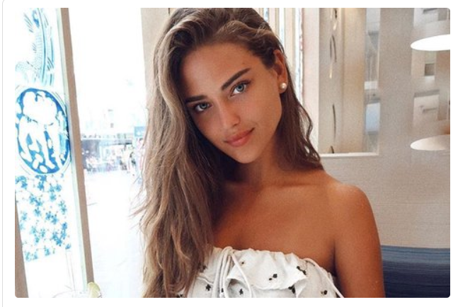
- Choose images according to the beauty standards of your target GEO.
- Interact with your user, include relationship or matching quizzes.
- Girls with tattoos are proven to receive more clicks.
- Flirty Phares in the header.
- Naked women on teasers is an already sign of bad taste. Mysterious and real looking girls is what converts now.
Nutraceuticals
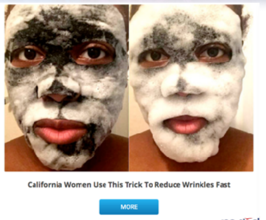
- For beauty or weight loss products, use a filter on the landing page. Users could upload or take photos of themselves to see how they will look without wrinkles or 20 pounds less. 👵➡👱♀️
- Share success stories and reviews. People believe in the magic power of the product if they have some evidence from others. Include photos and feedbacks from influencers to build customers’ confidence in your products.
Maria Gondar, MGID marketing outreach specialist


Leave your comment